

Solar Alliance
Solar Alliance came to us with a mission bigger than branding. As a renewable energy company operating in a crowded and often skeptical market, they needed an identity that could translate complex technology into simple human trust. Our task was to build a brand from the ground up—one that communicates clean energy innovation without corporate coldness, and environmental responsibility without cliché. The result is a visual and verbal identity system designed to feel as forward-thinking as the solar technology itself, connecting with homeowners, businesses, and communities who believe the future is bright, renewable, and within reach.
+5000%
-54%
+328%
>3s
>1,2s
10/10
+$8,000
7,384%




Solar Alliance — Building a Brand Identity for the Renewable Energy Industry
The renewable energy sector has evolved far beyond simply selling solar panels. Today's customers invest in confidence, expertise, and long-term partnerships as much as they invest in technology. For companies operating in this competitive environment, branding plays a critical role in communicating professionalism before the first conversation ever takes place.
Solar Alliance was developed to reflect exactly that philosophy.
The project focused on creating a modern visual identity for a renewable energy company committed to innovation, sustainability, and technical excellence. The objective was not simply to design an attractive logo, but to build a complete brand system capable of supporting business growth across digital platforms, printed materials, vehicle graphics, signage, and corporate communications.
From the earliest discovery sessions, it became clear that the company needed an identity that balanced engineering precision with environmental responsibility. Many competitors relied on predictable industry visuals—generic sun icons, green gradients, leaves, or abstract energy symbols that made brands difficult to distinguish from one another. Our goal was to move beyond these familiar conventions and create an identity with a stronger sense of professionalism, confidence, and longevity.
Rather than following temporary design trends, we focused on developing a timeless visual language built around simplicity, consistency, and strategic thinking.
The project began with understanding how customers perceive renewable energy companies. Purchasing a solar energy system represents a significant investment, and clients naturally seek organizations they can trust. Every visual touchpoint therefore needed to reinforce reliability, technical knowledge, and long-term commitment.
This understanding shaped the creative direction from the very beginning.
Instead of emphasizing environmental symbolism, we chose to communicate sustainability through clarity and intelligent design. The resulting identity feels modern without appearing overly corporate, approachable without sacrificing authority, and premium without becoming inaccessible.
Several strategic objectives guided the creative process.
Primary project goals included:
- creating a distinctive identity within a highly competitive industry
- communicating professionalism and technical expertise
- designing a scalable visual identity system
- supporting both residential and commercial audiences
- ensuring consistency across digital and physical applications
- establishing a timeless brand rather than a trend-driven aesthetic
Developing the logo became one of the project's most important phases.
A successful renewable energy logo must communicate innovation while remaining simple enough to perform effectively across numerous applications. Rather than relying on overly descriptive illustrations, we explored geometric forms, balanced proportions, and clean typography capable of representing the company's forward-looking vision.
The final identity combines strong typography with a clean symbol that reflects energy, movement, and progress without becoming visually complicated. Every line and proportion was refined to improve readability, scalability, and recognition across different sizes and production methods.
The simplicity of the mark allows it to function equally well on business cards, websites, uniforms, fleet vehicles, presentation materials, and large-scale exterior signage.
Typography became another defining component of the identity.
Instead of decorative typefaces, we selected modern, highly legible typography that reinforces confidence and technical precision. Strong headline styles establish authority while supporting typography creates clear information hierarchy across marketing materials and corporate communications.
This disciplined typographic system helps every customer interaction feel consistent, whether viewed online, in print, or on-site during installations.
Color selection required equally careful consideration.
Renewable energy brands frequently depend on combinations of bright green and yellow to communicate sustainability. While instantly recognizable, these palettes often appear generic and struggle to differentiate one company from another.
For Solar Alliance, we developed a more refined palette that balances professionalism with optimism. Carefully selected colors communicate energy, innovation, and environmental responsibility without relying on obvious visual clichés. The restrained approach increases versatility while ensuring consistent reproduction across digital media, offset printing, large-format graphics, and branded merchandise.
Creating a visual identity, however, extends well beyond the logo itself.
Every customer interaction contributes to brand perception, making consistency one of the project's highest priorities. We developed a complete visual language that establishes clear relationships between typography, spacing, color, and graphic elements, allowing the company to present itself consistently across every communication channel.
Rather than producing isolated design assets, the objective was to build a flexible system capable of evolving as the business grows.
Project scope included:
- brand strategy
- logo design
- visual identity development
- typography system
- color palette
- stationery design
- vehicle graphics
- marketing materials
- digital brand assets
- brand presentation
One of the most rewarding aspects of the project involved applying the identity across real-world materials.
Business stationery demonstrates professionalism through clean layouts and carefully structured typography. Corporate documents maintain visual consistency while improving readability. Marketing collateral reinforces the same identity without becoming repetitive, allowing every communication piece to contribute to long-term brand recognition.
Vehicle graphics became particularly important because installation vehicles often function as moving advertisements. Unlike many branded fleets overloaded with information, the Solar Alliance graphics prioritize visibility, simplicity, and immediate recognition. Clean compositions ensure the logo remains highly legible from a distance while supporting a professional appearance on every job site.
Digital applications were designed with equal attention.
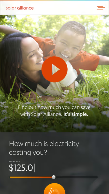
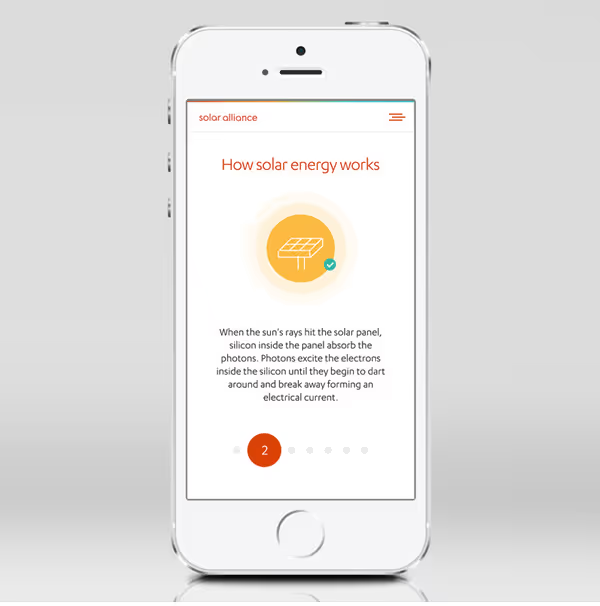
Today's customer journey almost always begins online, making consistency across websites, presentations, social media, and digital advertising essential. The visual system was developed to translate seamlessly between print and digital environments without losing its distinctive character.
Scalability remained one of the project's central design considerations.
As renewable energy companies expand, they frequently introduce new services, technologies, partnerships, and marketing initiatives. An identity built only for today's requirements quickly becomes restrictive.
To prevent this, every element of the Solar Alliance brand was designed as part of a larger visual framework rather than as isolated graphics. Consistent spacing, typography, color relationships, and layout principles create a flexible system capable of supporting future growth while maintaining strong brand recognition.
The project also presented several interesting creative challenges.
The first involved differentiation.
The renewable energy industry has developed many recognizable visual patterns, making it surprisingly difficult to create something distinctive while remaining immediately relevant. Avoiding obvious symbols without losing industry recognition required careful exploration and refinement.
The second challenge involved balancing innovation with trust.
Customers investing in renewable energy expect cutting-edge technology, but they also seek companies with stability and experience. The identity therefore needed to communicate progress without appearing experimental. Every visual decision was evaluated according to how effectively it balanced these two qualities.
Another challenge centered on versatility.
The identity had to perform equally well across business cards, fleet graphics, uniforms, signage, digital platforms, and presentation materials. Achieving consistency across such varied applications required disciplined design decisions from the earliest stages of development.
Rather than relying on complex visual effects, the system depends on proportion, typography, spacing, and thoughtful composition to maintain its character regardless of scale or medium.
Throughout the project, we continuously refined the work by asking a simple question: does every element strengthen the brand?
If a graphic detail failed to improve clarity, recognition, or professionalism, it was simplified or removed. This process of thoughtful refinement ultimately produced a cleaner, stronger identity capable of supporting the company's long-term ambitions.
Key outcomes of the project include:
- a modern and memorable visual identity
- a professional logo designed for long-term scalability
- a cohesive typography and color system
- consistent branding across print and digital media
- vehicle graphics that increase brand visibility
- premium corporate stationery and marketing materials
- a flexible identity system prepared for future expansion
The completed Solar Alliance identity demonstrates how strategic branding can elevate perception in a highly competitive industry. Instead of relying on familiar renewable energy clichés, the brand communicates confidence through clarity, precision, and consistency.
At VanDesign, we believe successful branding is not measured by visual complexity but by how effectively every design decision supports business objectives. Solar Alliance reflects that philosophy from beginning to end—a carefully crafted identity built to inspire trust, strengthen recognition, and provide a scalable foundation for sustainable growth in the renewable energy market.
%402x.svg)
%402x.svg)

%402x.svg)