

SkinXpert
SkinXpert is a globally positioned skincare brand engineered to convey trust, clinical credibility, and premium sophistication across diverse international markets. Our mandate was to craft a cohesive brand identity that appeals to discerning, health-conscious consumers while building a flexible foundation for product line expansion and cross-border recognition.
+5000%
-54%
+328%
>3s
>1,2s
10/10
+$8,000
7,384%


SkinXpert — Crafting a Contemporary Skincare Brand for a Global Audience
Some branding projects begin with a logo. Others begin with a color palette or a collection of product ideas waiting to be packaged. SkinXpert started with something far more fundamental—a desire to create a skincare brand that people would immediately perceive as knowledgeable, refined, and trustworthy without relying on familiar industry clichés. The objective wasn't simply to design attractive visuals. It was to build an identity capable of communicating expertise through every interaction while providing a flexible foundation for future growth.
The skincare industry continues to evolve at an extraordinary pace. Consumers compare ingredients, research formulations, read reviews, and evaluate brands long before making a purchase. Beautiful packaging alone is no longer enough to earn confidence. Visual identity has become one of the most important indicators of credibility, often shaping first impressions before customers experience the product itself.
Our role was to develop a brand identity that felt confident yet approachable, sophisticated yet uncomplicated. Every design decision would contribute to a cohesive system that could support the brand across packaging, digital media, print materials, presentations, and future product collections.
Rather than following trends currently dominating the beauty industry, we wanted to create something with longevity. Trends inevitably change, but well-considered design principles continue working for years. This philosophy guided every stage of the project, from naming and typography to layout systems and supporting brand applications.
One of the earliest challenges was positioning the brand within a highly competitive market. Many skincare companies adopt either a pharmaceutical appearance built around clinical precision or a lifestyle aesthetic focused on natural ingredients and organic imagery. While both approaches have proven successful, they often look remarkably similar to one another. Our ambition was different.
SkinXpert needed to communicate scientific expertise without becoming visually sterile. It needed to feel premium without appearing exclusive. It needed enough personality to become memorable while maintaining the clarity expected from a modern skincare company.
Achieving that balance required restraint more than decoration. Instead of asking how many elements we could add to the identity, we continually asked how many could be removed while making the brand even stronger.
That philosophy became the foundation of the project.
Before exploring visual concepts, we established several creative objectives that would guide every decision throughout the branding process.
Our goals included:
- creating an identity that communicates expertise at first glance
- developing a memorable and internationally accessible brand name
- designing a flexible identity system rather than a standalone logo
- ensuring consistency across digital and printed media
- building a timeless visual language capable of supporting future product expansion
Naming represented one of the most strategic phases of the project. A successful brand name needs to accomplish far more than sounding attractive. It should be memorable, easy to pronounce, visually balanced, and immediately relevant to its industry. It should work equally well on product packaging, websites, presentations, and marketing materials while remaining recognizable across different markets and languages.
The final name, SkinXpert, combines clarity with distinction. The relationship between "Skin" and "Expert" communicates the brand's area of specialization immediately, while the stylized "X" introduces a subtle contemporary character that differentiates the identity without reducing readability. The name is direct, confident, and versatile—qualities that align naturally with the positioning established for the brand.
With the naming completed, attention shifted toward the visual identity itself.
Rather than relying on symbols commonly associated with cosmetics or healthcare, we focused on typography as the defining element of the brand. The logo was intentionally designed as a refined wordmark, allowing proportion, spacing, and balance to become its strongest visual characteristics. Every adjustment, however small, contributed to improving rhythm and overall harmony.
Designing a typographic identity requires considerable discipline because every imperfection becomes immediately visible. There are no supporting illustrations or decorative graphics to distract the eye. Success depends entirely on precision.
Multiple iterations explored spacing relationships, stroke balance, optical alignment, and character proportions until the wordmark achieved the confidence and simplicity we were looking for.
The resulting logo feels understated rather than attention-seeking. It doesn't compete with products or packaging. Instead, it complements them, allowing the overall brand experience to feel cohesive and refined.
The visual language developed around the logo follows the same principles.
Instead of introducing elaborate graphic devices, we focused on composition. White space became an active design element rather than an empty area waiting to be filled. Carefully structured layouts create breathing room that allows typography and imagery to communicate with greater clarity. Every page, presentation, and application benefits from this disciplined approach.
Minimalism is often misunderstood as the absence of design. In reality, it demands significantly more consideration because every remaining element carries greater responsibility. When visual noise disappears, proportion, alignment, spacing, and hierarchy become essential.
That attention to detail extends throughout the identity.
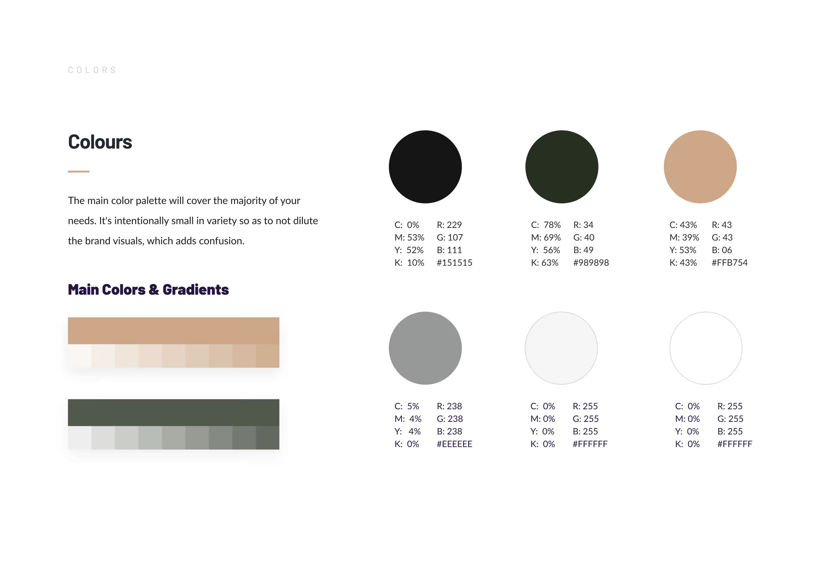
Color selection followed a similarly restrained philosophy. Rather than relying on fashionable palettes that quickly become dated, we developed a refined color system capable of supporting both premium presentation and practical production requirements. Neutral tones establish sophistication while carefully selected accent colors introduce personality without overwhelming the overall identity.
The restrained palette performs consistently across digital platforms, printed materials, stationery, and conceptual packaging. Maintaining consistency across different production methods was an important consideration throughout development, ensuring the brand retains its character regardless of medium.
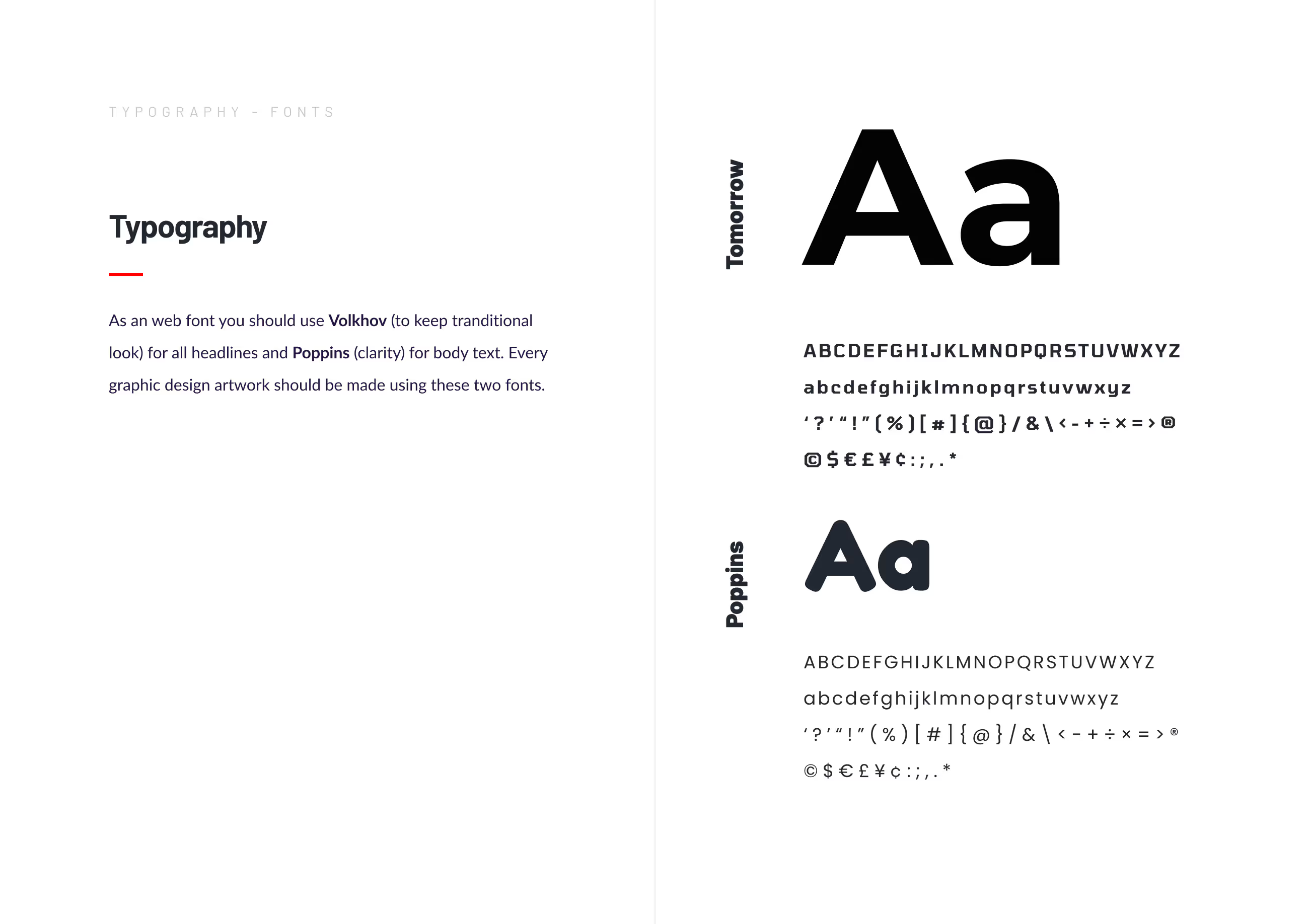
Typography became another defining characteristic of the identity system.
Beyond simple readability, typography establishes tone. Strong headlines communicate confidence while supporting text provides clarity and structure. Carefully considered spacing improves legibility while reinforcing the premium nature of the brand. Every typographic decision contributes to creating an experience that feels calm, professional, and intelligently designed.
Rather than treating fonts as interchangeable design assets, we built a hierarchy that allows every communication piece to maintain the same recognizable personality. Whether viewed on a presentation slide, business card, website, or packaging concept, the typography supports a consistent brand experience.
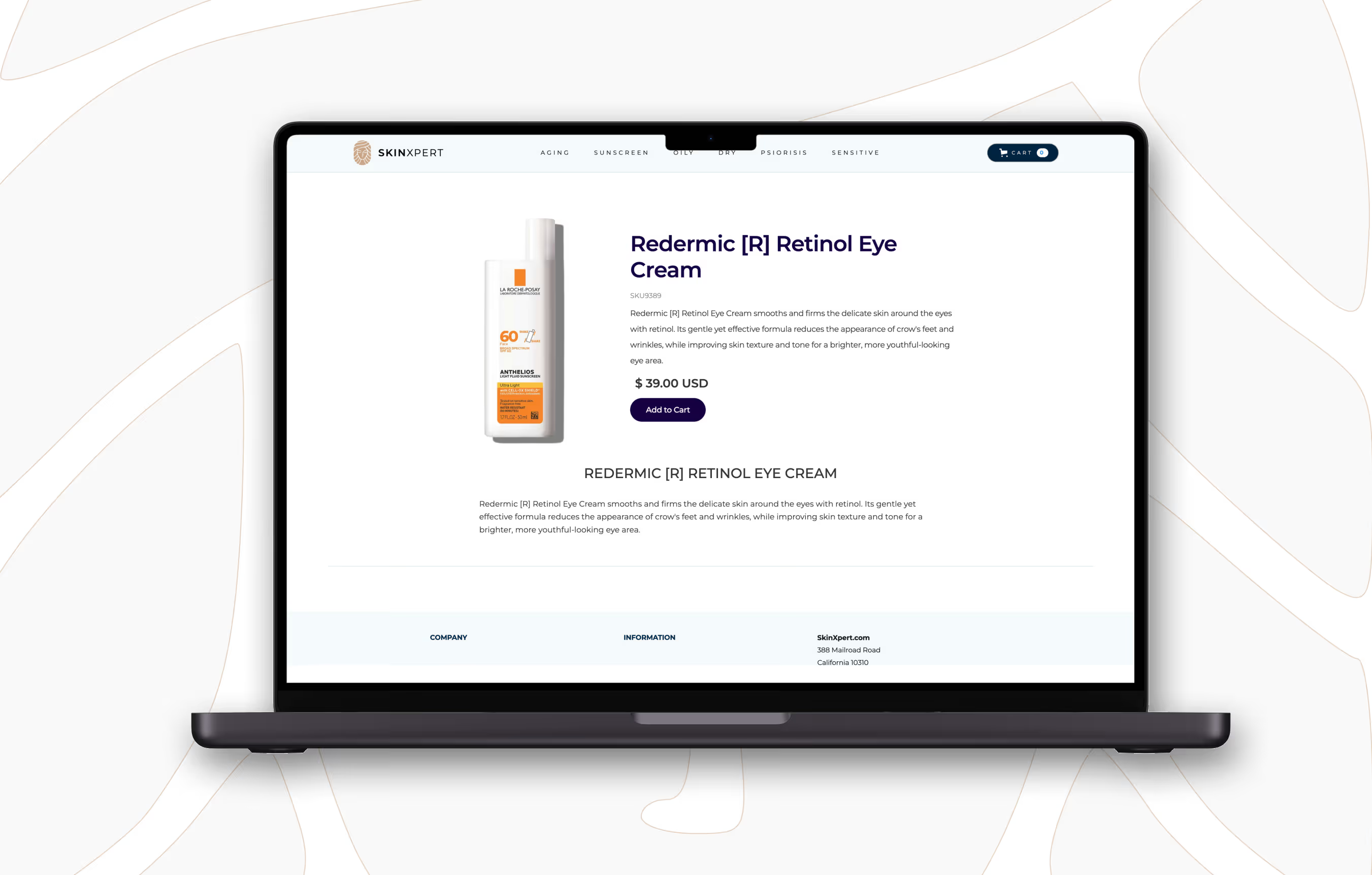
Developing a visual identity is only part of the process. A successful brand must demonstrate how it performs across real-world applications. For SkinXpert, supporting materials became an opportunity to reinforce consistency rather than simply showcase individual deliverables.
Project scope included:
- strategic brand direction
- brand naming
- logo development
- visual identity design
- typography system
- color palette creation
- stationery design
- packaging concepts
- presentation design
Each application was approached as part of a larger system rather than an isolated graphic exercise.
Business stationery demonstrates professionalism through disciplined layouts and refined typography. Presentation materials extend the same visual language into client-facing communications. Packaging concepts illustrate how the identity can elevate product perception through structure, hierarchy, and restrained design rather than excessive graphics.
Packaging deserves particular attention because it often provides a customer's first physical interaction with a brand.
The challenge was to create concepts that communicate quality without relying on decorative embellishment. Instead of overwhelming the surface with visual elements, the layouts prioritize clarity, readability, and carefully balanced composition. Typography becomes the primary storytelling device while generous spacing reinforces the premium positioning of the products.
The result is packaging that feels contemporary, elegant, and purposeful.
Another significant challenge involved designing for future expansion rather than immediate presentation.
Many branding projects succeed visually but become difficult to maintain once additional products, campaigns, or marketing materials are introduced. We wanted SkinXpert to function as a scalable system capable of evolving alongside the business.
This required establishing clear design principles instead of rigid templates.
Consistent spacing, typography, color relationships, and layout logic create a flexible framework that allows future applications to remain recognizable without appearing repetitive. The identity can grow naturally while maintaining the qualities established during the initial branding process.
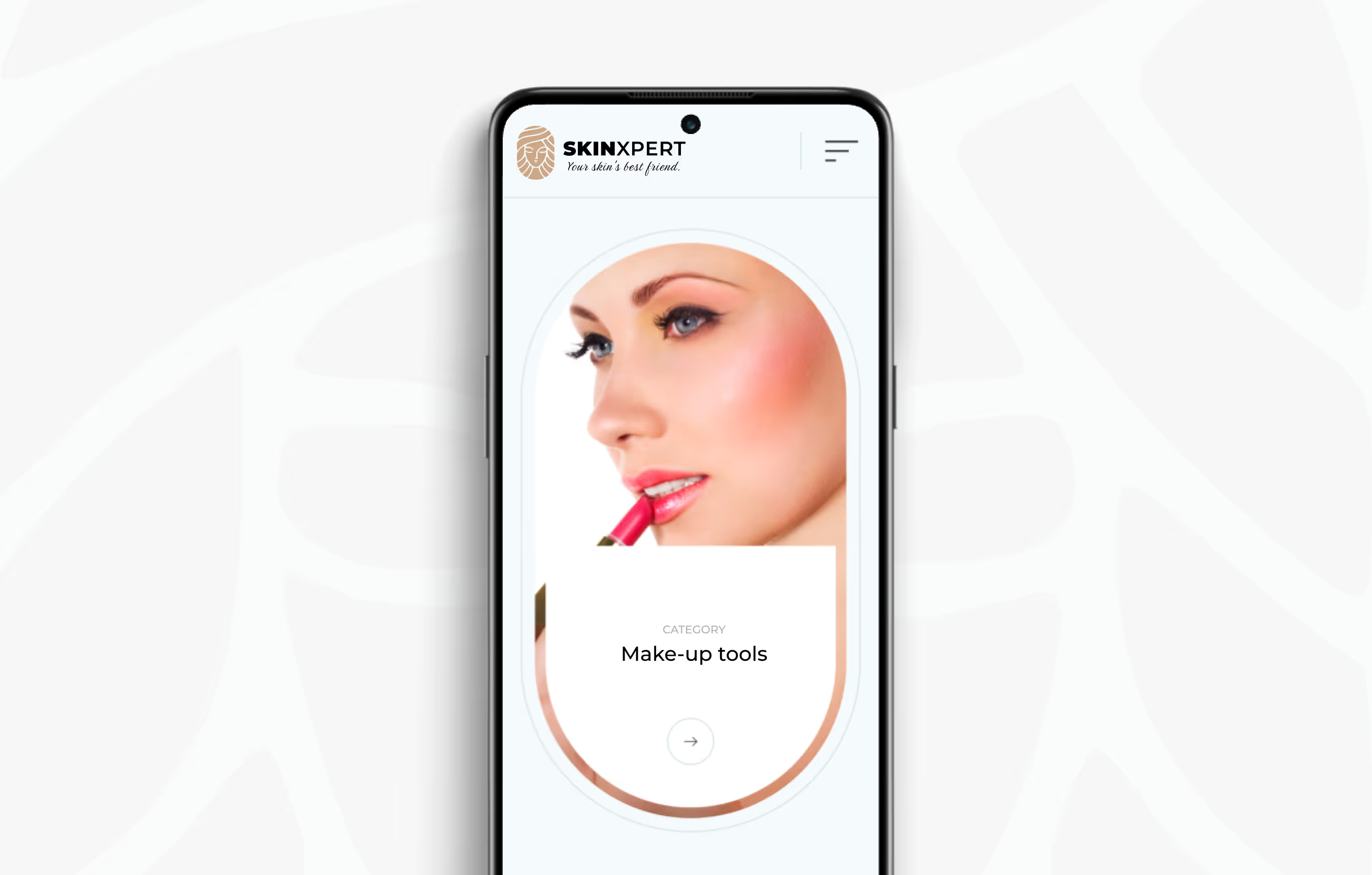
International usability also influenced many design decisions.
Minimal visual systems often communicate more effectively across different cultures because they depend less on symbolic references and more on universally understood design principles. Clean typography, balanced composition, and restrained color palettes provide flexibility regardless of language or geographic market.
Rather than following temporary aesthetics popular within a single region, the identity was intentionally designed to remain relevant wherever the brand chooses to expand.
Throughout the project we continually evaluated every creative decision against one central question: does this strengthen the brand?
If an element failed to improve clarity, recognition, or consistency, it was refined or removed. This process of continuous simplification produced an identity that feels confident without becoming rigid, elegant without becoming decorative, and modern without chasing design trends.
The completed branding system demonstrates how thoughtful design can communicate expertise without relying on obvious visual conventions. Every component contributes to a unified experience built on proportion, typography, spacing, and disciplined execution rather than visual excess.
The final deliverables provide:
- a memorable and internationally adaptable brand name
- a refined typographic logo with strong recognition
- a scalable visual identity system
- premium stationery and presentation materials
- packaging concepts supporting future product ranges
- consistent branding across print and digital applications
- a timeless foundation for long-term brand development
SkinXpert represents the kind of branding we believe creates lasting value. It is not defined by trends, decorative effects, or short-term visual impact. Instead, it is built on strategic thinking, careful refinement, and attention to the details that shape how people perceive a brand.
At VanDesign, every identity is developed as a complete design system rather than a collection of individual assets. SkinXpert reflects that philosophy from beginning to end—combining strategic naming, refined typography, disciplined visual language, and scalable applications into a cohesive brand prepared to grow confidently in an increasingly competitive global marketplace.
%402x.svg)
%402x.svg)

%402x.svg)